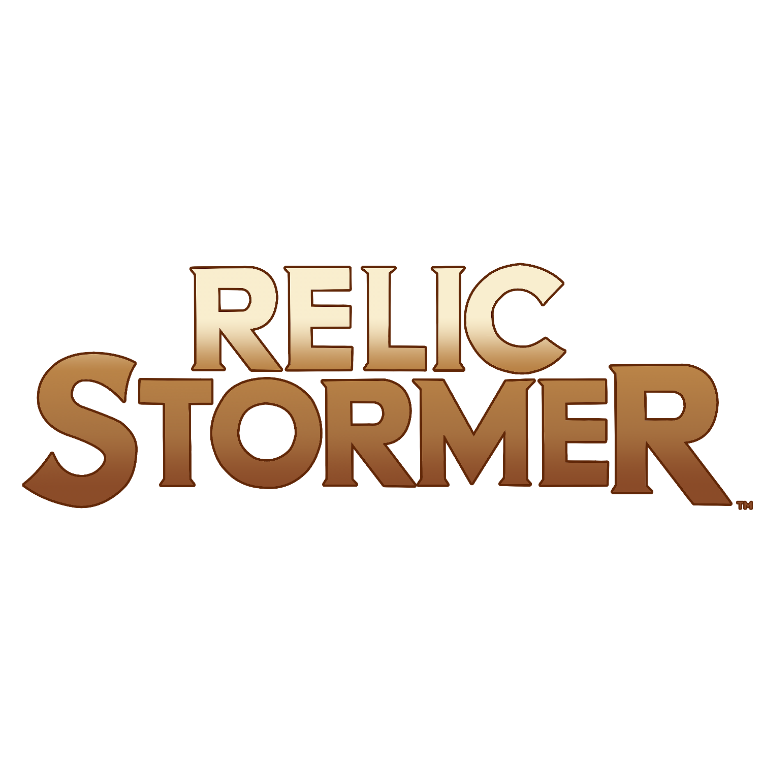
Welcome to the third in Knightspire’s series of logo discussions about Kate Karter, Relic Stormer! This post will give you a behind-the-scenes look at the choices made during the design process for the Relic Stormer logo. To find past and future articles on other logos, check out our dedicated character sites – you can find these linked in a character’s full profile page on Knightspire.com.
Relic Stormer was one of the later logos that we made during our first batch of designs. As one of our cornerstone characters, like Black Ronin, Kate Karter was an essential part of the Knightverse. She introduced the world of Relic Stormers, opening up the narrative to a global and historic scale. For this reason, we needed her logo to reflect her work as a relic and treasure hunter.
Relic Stormer: Adventurers for Hire
Relic Stormers are adventurers for hire, tracking down the most prolific treasures and mythical relics for wealthy clients. We wanted her logo to have an old-world feel, representing her time hunting down precious artefacts. The font needed to be sturdy and strong, much like Kate herself. We chose a thicker and smoother style for each letter, showcasing her unwavering determination once she’s set her mind on something.
The Resilient Treasure Hunter
Kate is a survivor, chiselled by her hardships. Her logo needed to reflect this side of her nature. She is logical, methodical, and meticulous, leaving no stone unturned. The infamous Relic Stormer is always on the move, seeking the best-paid missions to gain security. But she is not careless. If a mission is too dangerous or has low chances of success, she considers and even rejects requests. But when she does make up her mind, she is the best of the best.
Gold for Glory and Wealth
Kate Karter comes from a poor background, surviving off salvage and scrap during her youth in the Driftlands. Her past strengthened her resolve and will, and fuelled her desire for money. A vow to never struggle like she did before. Given the nature of her work, and her own needs, the Relic Stormer logo colour was a relatively easy choice. Gold represented the treasures and relics, and Kate’s payment for her work.
Check out our previous entries on The Black Ronin logo, which you can find on The-BlackRonin.com, and Grace on GraceSlayer.com.


Pingback: Grace Slayer: A Logo Design Discussion